

On the Rocks Bartending's Brand Design and Point of Purchase Web Page
Year
2019
Services
Branding & Logo Design
Graphic Design
User Experience Design
Web Design
Client
On the Rocks Bartending
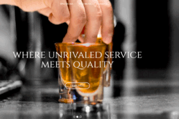
When I was approached to design the logo and website for On the Rocks Bartending, I knew right away this wasn’t just another event service, it was a brand built on personality, professionalism, and a love for craft cocktails. The goal was to capture that balance of laid-back charm and upscale service. The logo blends clean, modern typography with a subtle nod to classic cocktail culture, while the website delivers an inviting, intuitive experience that makes booking feel effortless. Every visual decision was made to reflect the team’s confidence behind the bar and the elevated energy they bring to every event. Designing for On the Rocks meant building a brand that feels as good as that first sip; smooth, memorable, and just the right amount of bold.
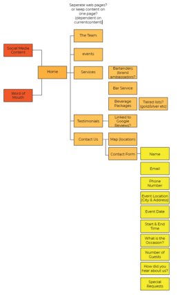
The challenge was to get the brand's already existing and thriving social media presence into a digital space that represents them and where customers can request services.
After designing the new visual identity and website for On the Rocks Bartending, I knew the next step was making sure it didn’t just look great. it had to work great, too. With a clean layout, smooth navigation, and crisp mobile responsiveness, the new site was built to convert curious clicks into real bookings. So I shifted all existing social media traffic from Instagram posts and story links to Google listings and email signatures directly to the new website. Every call to action now points to a single destination that fully reflects the On the Rocks brand: polished, professional, and ready to serve. The result? A consistent, elevated presence that turns online impressions into real-world events.
PMS® Cool Gray 1C
C0 M0 Y2 K0
#D9D9D6
PMS® 135 C
C0 M50 Y100 K0
#ffc557
Pantone® 296 C
C5 M42 Y93 K0
#eda032
Pantone® 7720 C
C86 M40 Y8 K35
#1c5a3e
The Waiter's Tuxedo with a citrus twist
The brand color palette for On the Rocks Bartending started with a simple idea: the timeless sophistication of a waiter’s tuxedo. Crisp black, clean white, and soft charcoal created a foundation that felt instantly classic, professional, sharp, and service-forward. But the brand needed something more; a spark that captured the warmth, energy, and personality of their events. That’s where the orange accent came in. I introduced a rich, vibrant orange as a signature pop of color — not just to grab attention, but to balance the formal palette with a sense of fun and approachability. It evokes the zest of a fresh cocktail garnish or the warm glow of an evening event. Strategically used in buttons, highlights, and key visuals, the orange acts like a bartender’s charm: subtle, but unforgettable. Together, the palette tells a clear story. Polished service with personality. It looks just as good on a linen napkin as it does on a glowing phone screen, and that was exactly the point.
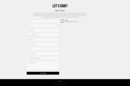
The photo’s above represent what the website looked like when it started. We wanted to test each module overtime and see what worked and what did not based on feedback and interactivity with the website. Since the website has a modular backend, we were able to modify and tune the website to what was working and what was not through A/B testing and a statistical approach.
When I started working with On the Rocks Bartending, they had a strong presence on social media; especially Instagram but no real home base for their brand. Inquiries were coming through DMs, event info was scattered across posts, and potential clients were left piecing together the story on their own. That’s where I stepped in.
The first step was to understand how their audience was already engaging with them. Most people discovered them through eye-catching photos, tagged posts from past events, or quick clips of their bartenders in action. I used that insight to design a clean, conversion-focused web flow that seamlessly picked up where Instagram left off.
Now, every social media post, story, and link-in-bio drives traffic to a single, beautifully built website — one that mirrors the energy of the brand and simplifies the booking process. I made sure the most important questions were answered right away: What do they offer? How do I book? What makes them different?
The result is a smooth, intentional flow: Social media pulls people in, and the website seals the deal. It’s a system built to grow with them. No more juggling DMs and scattered info, just a polished, professional path from first click to final cheers.